Raptor-Dev-Display-Touchscreen: Difference between revisions
Jump to navigation
Jump to search
No edit summary |
No edit summary |
||
| Line 30: | Line 30: | ||
|- | |- | ||
! Toggle Switch | ! Toggle Switch | ||
| <p>Draws a toggle switch on the screen that will | | <p>Draws a toggle switch on the screen that will hold either an off or an on state.</p> | ||
| [[file:RaptorDisplayToggle Switch.jpg|frameless|border|Toggle Switch block|center]] | | [[file:RaptorDisplayToggle Switch.jpg|frameless|border|Toggle Switch block|center]] | ||
|} | |} | ||
Revision as of 13:31, 7 April 2015
New Eagle > Products Wiki > Raptor Platform > Raptor-Dev > Raptor-Dev Display Libraries > Raptor-Dev Display Touchscreen
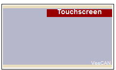
The blocks in this subsystem are used for touchscreen functions. These include defining buttons, reading button status, and touchscreen state.
Blocks
| Block | Description | Appearance |
|---|---|---|
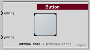
Button Definition |
Prints a button onto the touchscreen. |
 |
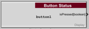
Button Status |
Outputs the 'isPressed' status of the touch screen button of the same name. |
 |
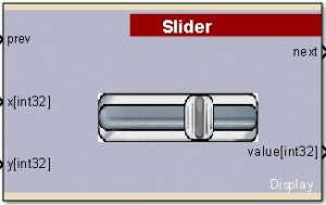
| Slider | Draws a slider on the screen that outputs a value from 1 to 100, essentially to provide a potentiometer to the user. |
 |
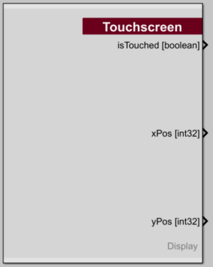
Touchscreen |
Returns the current state of the touchscreen. |
 |
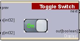
| Toggle Switch | Draws a toggle switch on the screen that will hold either an off or an on state. |
 |