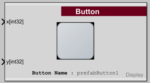
Raptor:Display Button Definition
Return to the main Raptor page

Description
This block defines a button & prints it onto the touchscreen. Only one copy of a button will print per screen.
Please note: Unicode characters (for multilingual support) require special handling! To print Unicode characters correctly, please use the function(s) raptor_utf8_printf_str( unicode_dec ) or raptor_utf8_printf_str(hex2dec( unicode_hex )) to print a single Unicode character, where 'unicode_dec' is the Unicode value of the character as a decimal & 'unicode_hex' is the character's Unicode value as a hex string.
Inputs
| Input | Type | Description |
|---|---|---|
| x | int32 | X position of button. |
| y | int32 | Y position of button. |
Parameters
| Parameter | Type | Description |
|---|---|---|
| Button Name | String | Name of button being defined. |
| Font | Specify which font to use for all button text. | |
| Custom Font | string | Custom True Type font to use for all button text.
Set the Font dropdown to "-CUSTOM-" to use this option. The font must be saved as a TTF file & must be located on the Matlab path. |
| Choose Font... | button | Opens a file picker to select a TTF file. |
| Button Image | string | Specify button image when button is not pressed. |
| Button Image... | button | Opens file browser to select image file. |
| Button Pressed Image | string | Specify button image when button is pressed. |
| Button Pressed Image... | button | Opens file browser to select image file. |
| Button Text Line 1 | string | Specify first line of text to appear on the button. |
| Button Text Line 2 | string | Specify second line of text to appear on the button.
You must set the first line of button text in order to have a 2nd line. |
| Text Near Button | string | Specify one line of text to appear next to the button. |
| Text Height - Line 1 | integer | Specify the height in pixels for button text line 1.
Text sizes from 1-130 pixels are valid. |
| Text Height - Line 2 | integer | Specify the height in pixels for button text line 2.
Text sizes from 1-130 pixels are valid. |
| Text Height - Near Button | integer | Specify the height in pixels for the text next to the button.
Text sizes from 1-130 pixels are valid. |
| On Button - Margin Size | integer | Specify the desired distance in pixels between the edge of the text & the edge of the button.
This value only matters for non-centered text alignments. |
| On Button - Vert. Alignment | Specify the desired vertical alignment (top/center/bottom) of the text on the button. | |
| On Button - Horiz. Alignment | Specify the desired horizontal alignment (left/center/right) of the text on the button. | |
| Near Button - Margin Size | integer | Specify the desired distance in pixels between the edge of the text & the edge of the button. |
| Near Button - Vert. Alignment | Specify the desired vertical alignment (top/center/bottom) of the text next to the button.
This value only matters for side alignments of Left or Right. | |
| Near Button - Horiz. Alignment | Specify the desired horizontal alignment (left/center/right) of the text next to the button.
This value only matters for side alignments of Top or Bottom. | |
| Near Button - Side Alignment | Specify which side of the button (top/bottom/left/right) the text next to the button should be adjacent to. | |
| On-Button Text Color | string (hexadecimal) | Specify the color of the text on the button when the button is not being pressed. |
| On-Button Pressed Text Color | string (hexadecimal) | Specify the color of the text on the button when the button is being pressed. |
| Near-Button Text Color | string (hexadecimal) | Specify the color of the text next to the button when the button is not being pressed. |
| Near-Button Pressed Text Color | string (hexadecimal) | Specify the color of the text next to the button when the button is being pressed. |
| Text Color...Pressed Text Color... | buttons | Opens a color picker to choose a color value for the button texts. |